Wednesday, October 2, 2013


.

Its been quite some time since I've posted....still been making cards, though! Here's a gallery of some of my favorites and some that offer a different twist, hope you like them.
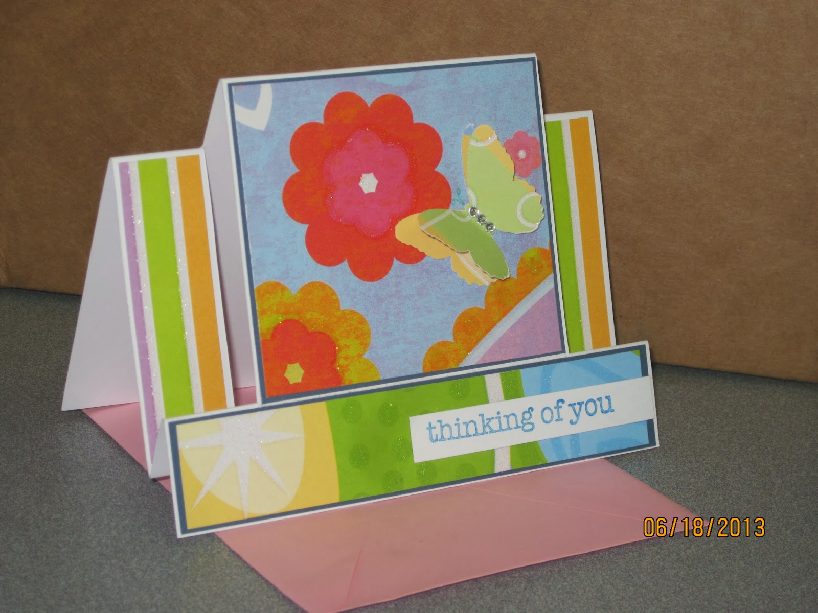

 This was made for a student I've worked with for several years who was moving over the summer. Thought bright & cheery! Tough to photograph the sparkle & the butterfly's dimension.

I was amazed at how just a simple stamp on some dsp with punched strips under made such a pretty card.


After a fabulous first season for my daughter cheer-leading, I found this digi stamp at Sweet & Sassy Stamps  & fun exploding fold to let all the girls show their appreciation.


What better way to celebrate a teen who loves to twist & turn on the trampoline than a birthday card that does the same.  This is my try at the Tri-fold with a Twist. The toughest part of this design was being sure the stripes were going the right way before cutting & gluing. The sentiments are computer journals, the front used a digi frame found here. Originally used the frames for book plates, found they come in handy!


Here's two fun techniques in one! I used a triple stamp layering technique on a spring card. The front of this one actually opens for the message inside, which makes for a slightly top-heavy card.

This was fun to make & I love the way the lattice EF came out for the base with the Martha Stewart flowers (stamp & punch set). I ended up adding some of the same water color pencil to the edges of the flowers that I used in the main image.


For this next card, I cased a technique I saw on Pinterest from Live Love Stamp. Didn't make mine shadowed, but did ink the edges & really like the way the stamp flows from one tile to another. 

Still working on using a fine line with glitter, but do like the way the sentiment came out with the embossing. Stamp is from Hot off the Press - Heart to Heart Greetings.


...and this one? Well, its simple, but just plain pretty.                                                                        I used a printed cardstock then made the band with a MS border punch. Love the butterfly, it was die cut from another piece of printed stock.                       

That's it for now, will be posting more soon. Thanks for taking a look!

Tuesday, January 8, 2013

Shaker

I am very intrigued by moving parts and different types of folds in card making. Since my sister also makes cards, I thought she'd be a good guinea pig for this one. Hopefully, she'll appreciate the attempt anyway.


I started with the stamped image I colored with my trusty watercolor pencils, just love the soft look!  

This next couple of steps go against the "should dos" but...I made it up as I went, so.... I cut the window in the main card; attached a piece of acetate to the back of the front; mounted the stamped image to the back side of the front of the card, using strips from around the pop-squares dimensionsals (instead of using foam tape, which I didn't have handy). If you try this, remember....

1) you need some space for things to shake inside, so be sure to use an adhesive with depth.
2) check the size of your shaking element, mine is just a bit too big, doesn't move too freely - although since it sticks a bit, its not ever all down at the bottom like finer glitter might be.
3) be sure to completely block all edges of the window - you don't want to loose your element in the envelope during mailing (or as they take it out!)
4) This is a dimensional card, so the top fold is actually two folds about 1/16th to 1/8th inch wide.

I like to finish the inside of the fronts too, so I cut a matching piece of the yellow card to cover that up, mounted on the back of the white stamped area.

ok, now to the out of order steps....
The gold cardstock seemed very blank, so I took a stamp, inked it up in slate grey, brought the window piece back in to protect the window, stamped once then turned it & stamped again. I kind of liked the way it wasn't perfect....to finish it off, added the ribbon, tucked behind the front, used another piece for the bow. Finally, I typically secure the tabs of the bow to keep it just right.

I'm thinking that it would make much more sense to stamp the front before adhering the stuff to the back, you know....a flatter stamping surface & all...seemed to work though.

Give it a try! Thanks for looking.

Wednesday, December 5, 2012

The Christmas Card Gift

When I began making cards, it was strictly something I did to express some creativity and love for people I sent to. I can't possibly buy gifts for the 60 or so on my list, but I can make 60 cards and think of all the people I send to as I create. 


This year I've been blessed by people appreciating my style to the point of asking for me to create cards for them to give or send.  Mostly its been requests for one card at a time. I find this challenging because I design around the recipients as I know them, and if I don't know them its kind of tough to do that. 

A while back, I showed some friends a design idea I had to get their feedback. One really seemed to like the concept & asked that I make her some cards to send out. When her plans changed, I still had the supplies & a start to a design I could see so......I took this opportunity to take a leap of faith and create the cards for our church bazaar.


Ok, for the recipe....5x7 card base; large green cs to anchor everything

The large tan cs is textured so I was sure to run it through the embossing folder with the texture up.  Within the frame opening, I used a slightly different green cs & then the focal - a reindeer stamped in chocolate brown on a very light green dp. Around the deer I stamped some snowflakes & the swirl in bronze then used embossing powder to give it just a little glow.

Truth be told, I did the embossed pieces first having made a template so to be sure my deer would fit within it....didn't want to have any stray embossed areas on the deer from the ink still being workable.

The lower portion echos the light green dp as a matting for the tan cs. I used the same chocolate brown for the sentiment. 

The big question then was, red nose or no red nose. It came down to red nose for the church bazaar and not for the gift for my friend. Plus, on the church set, I added a sheet of acetate to wrap the front - give it a more "shelf" look.

Here they are as a single card & then the accompanying set.


Thanks for stopping by.

Wednesday, November 21, 2012

Soft Stained Glass

I found out a few days ago that my Aunt's husband passed away earlier this month.  It wasn't unexpected, but still tough on her, I'm sure. Since its been a few weeks, I decided a traditional Sympathy card wasn't quite right. 

Looking through the paper stacks & stamps for some inspiration, I came across a book of Stained Glass Vellum papers from Hot off The Press...so now is the time to try something new. 

The papers come with a border of  stained glass look. Some are strips of a continuous image, some are divided into panes.

I chose to trim out the pane cutting carefully around the portion of the image that lays over the border.  Wanting to highlight the look, I matted it on a piece of water color paper, nice white & very subtle texture.
Next, had to pick the background papers, liked the look  of the shiny teal but it was just slightly too small for the card from on its own & then it looked to plain, even backed with the dark beige. Turning to the Cuttlebug, ran it through with an embossing folder that echoed a paned look, like stained glass....

Finishing it off with a simple sentiment stamped on the dark beige & then matted in a darker turquoise cs.  I hope it brings my Aunt some comfort...
  

Sunday, October 28, 2012

Halloween Treats

So, let me first say that my son took the pictures with his iPod. I realized too late I hadn't taken any pictures....and no pictures after this much work, is just not okay - lol!

The pre-teens & teens in our church had organized a party / haunted maze. sounded like a neat opportunity to try out some treat packages....Didn't come out as I'd envisioned, but the kids enjoyed them.

The topper: black CS edged with a the Martha Stewart spider web around the page punch - only on the front edge & corners...then, a scalloped punch of white cs with a simple stamp of each - spider & boo!

The trickiest part....getting the bag to stay in the cupcake wrapper. For that, I put the wrapper in a cupcake pan, ran the double stick tape in a couple of places, then stuck the bag down - put in some candy corn, one mini Hershey, stapled & stuck on the topper.

42 done! Happy Halloween.....


Busy Months

The start of the School year always brings with it a ton of activities & never enough time.  It is also a busy time for family birthdays. Committed to not buying anymore cards given all the supplies in the house, some cards make it on time, some not quite.  Here is a brief overview of some of the cards.....


For a brother who is an avid bike rider...turning 50....The bike is a digi print from Rhoda Design Studio; Bike Stamps. I had picked up some vinyl rub ons a while back, first time I used it, but think it works well here.

 
Always interested in exploring options for folds, I took this to a Z-fold. Not too complicated, but a bit of special for 50.


Next, my mother in law's birthday....for this, I wanted something a bit whimsical & fun, but soft....

I used some designer papers, the entire image is one stamp, used some embossing for a subtle sparkle...no, you can't see it in either of the photos. The outline is a CB embossing folder. For a different twist, I ran the ribbon on an angle.
 
 
 Next up.....two nephews. Actually, one got his very late....unfortunately, not that out of the ordinary. But, the second one had his on time - YEAH!

Enough of that, now to the cards...

Wanted to try this effect, different dp with opposite rounded corners. Very simple, but a neat look. Topped off with a plain greeting & stamped cake piece, colored with pencil. Perfect for a 20 yr old. (should start now to think what I'm going to do for him next year - the big 21)


For his younger brother, he's kind of into guitars, and turned 14 so he needed a TEEN card. Searched for an appropriate digi & found it - a Stampin' Up brush stamp - Extreme Guitar. Printed up a computer greeting, turned the black matt on an angle & its that simple. Oh, the digi comes black, I washed it out for the grey look. 

The very first fun punch I ever purchased (12 yrs ago, mind you) was this music note. I first used it as part of a cake decoration for my then 3 yr old. Best of all, I just received an email from this nephew, he thought the card was "pretty cool" - I'd call that success with a 14 yr old - lol!

Next up, Halloween treat bags for a church party.....

Wednesday, September 26, 2012

For a Special Lady

My mother asked me to make a card for a special woman who is retiring from working with the preschool at their church. I had a blank slate, except I do have this thing for butterflies. It feels to me as though they symbolize growth. 

This is a woman who had volunteered for many years & had undoubtedly helped many children fly in one way or another. 

So, after sifting through the pads of designer paper, I came to rest on this soft violet tone. Used a coordinating DP off set on the front of the card rather than a traditional all around border. 

For the sentiment, I used the Layered Labels template by Hot Off The Press. I haven't used them much so I just realized on this "label" that once you trace one time around, if you flip it over & trace again, you get a complete outline to follow - much neater that way then guessing where the line goes to connect.   Anyway, I stamped before I cut to be sure I chose the right label. After cutting, I realized I had a smudge from the ink - what to do? Shade all the edges of course. I tested out the idea of ink on a makeup sponge - too much. Ended up going back to pastel chalk - that has to be one of the best tools I've ever bought; its lasted so many years already & you'd think I bought it yesterday. I used the makeup wedges with the chalk & smudged the edges - no more "mistake".

I layered a rectangle behind it with rounded corners and popped the sentiment up. 

okay, now the butterfly.....

I used the same designer paper, punched with a MS butterfly punch - twice. I needed 2 butterflies so they'd add dimension to each other. The two are stuck together at the body in the center. I used glitter & embossing powder both to get a bit of shine & shimmer on the wings. The body I just touched up with a bit of white gel pen. The antenna were a bit tougher...after looking at several options, the charcoal grey watercolor pencil was perfect. 

Hoping it shares the attitude of gratitude with its recipient.